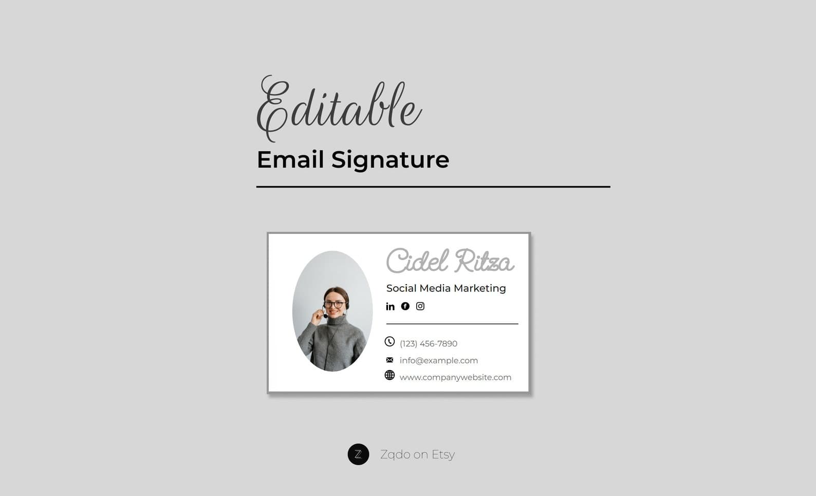
HTML Email Signature Template with Photo
A professional HTML email signature with photo and logo—minimal editable design for business email.
Email Signatures · Guide
The signature mistakes that make brands look inconsistent, spammy, or hard to contact—plus fixes.
Updated August 8, 2026 · 5 min read
The most common email signature mistakes are overcrowding, broken mobile layouts, outdated links, unreadable images, and using the footer as a full ad unit instead of a simple contact card.
If the signature is longer than the email, recipients ignore it. Keep essentials, cut decoration, and rotate promos rarely.
Wide tables, large logos, and stacked social icon rows create a vertical wall on phones. Always preview on mobile before rolling a design company-wide.
Plain-looking phone numbers and URLs that are not actual links force people to copy text. Make contact methods one tap away.
An email footer with old colors, an outdated logo, or a retired discount code creates trust friction. Treat the signature like packaging: keep it current.
When five teammates send five visual styles, the company looks uncoordinated. Use one template system and only personalize text fields.
Usually yes. Animation can look unprofessional, increase load issues, and distract from the message.
If counsel requires one, keep it short and text-based. Do not let legal copy dominate the design.
Ready-to-edit Zqdo digital products. Purchase happens on Etsy; this site is here to help you choose the right starting point.
A professional HTML email signature with photo and logo—minimal editable design for business email.
Keep exploring the email signatures topic cluster before you buy.